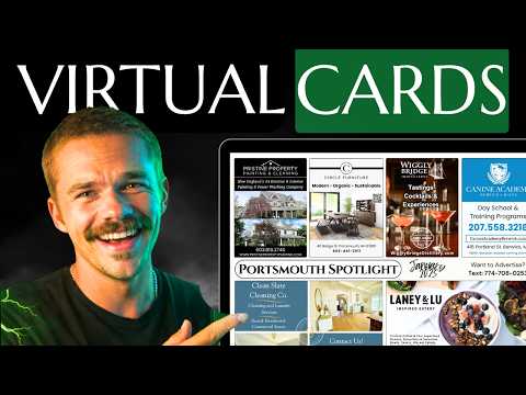
Mitchell critiques member 9x12 postcard sales websites, showing what works and what to fix, from calls to action and pricing tables to cost per door.
Key takeaways
- Break your slot price down to a cost per door, such as 5 or 10 cents per household, so advertisers see how cheap a shared card really is.
- Every hero section needs a clear call to action button, like call now, reserve your spot, or learn more, to move visitors further down the page.
- Skip explaining EDDM on your sales page and save it for when an advertiser asks how the cards reach every home.
- Avoid writing $500 a month, which sounds like an expensive subscription; say $500 and mention there is no long-term contract.
- Anything that looks like a button should work as a button, and all uppercase text should be toned down because it is harder to read.
Read the full guide
 9x12 Tools
9x12 Sites: Build Your Business Website Fast
9x12 Sites gives postcard operators a professional landing page in one afternoon — setup wizard, live card preview, built-in analytics, and lead capture.
15 min readVideo
 Getting Started
9x12 Postcard Side Hustle: Your First 90 Days
How long does the 9x12 postcard side hustle take to pay? A week-by-week look at the first 90 days, real hours required, and where most beginners stall out.
13 min readVideo
Read the full transcript
Auto-generated from the video, lightly formatted. Expect a few typos.
What's up, guys? I'm going to be reviewing and critiquing your 9x12 websites, and let's just get started. Okay, we're already off to an interesting start. Here we have the Port Spotlight, and I love this hero section. It looks like they actually incorporated a mockup of one of their past spotlights in the actual name of the spotlight.
Really cool. That's clearly not Portsmith in the background. I think that's New York City. So, whoever this person is is an idiot. Um, but yeah.
All right. All right, I see we have a countdown for the next mailing. Pretty cool. Add some urgency. I'm not sure how I feel about the all uppercase letters.
It makes it a little bit more difficult to read. Honestly, I would I would make it uh normal capitalization. I like that you have the request a free sample. That's pretty great because then obviously you can send it right to them. They're they're a hot lead or you could even visit them in person.
Okay, a little bit of social proof. You have some big brands here that saw the results. So, they're probably people who previously advertised. Pretty smart to have. Again, with the uppercase, get turn that down a notch.
Kind of stupid of you to even think you could do that. Um, yeah, I like that you have contact buttons basically everywhere. So, no matter what point they're at in your website, they're if they're ready to call, they can they can they can call you. They're going to find you. Um, obviously, they're going to have a question at this point about the pricing.
And you bring them here. Okay, interesting pricing table. You break it down the different savings for different months. Okay, I'd like to see like per like 5 cents per household, 10 cents per household here, just to break it down. I see you have it here 10 cents per door, but maybe make that more obvious up here just to really give them an idea of how cheap this really is.
And wow, that's a lot of buttons, buddy. Turn the buttons down. Um, yeah. Not sure how you can even fix this, but this is pretty stupid. Four buttons.
Really? Eight buttons? 10 buttons. Hey, I like that you got the call support, though. Sum things up.
I like the summary. I like the colors and the the bolding, the important fonts. No required long-term commitment. That's pretty good. Oh, and you actually do spotlights in a few different towns.
So, this is a multi-page website. Cool. Again, with the uppercase letters, tone it down. But I do like how you colorize certain fonts to make them really pop. A th this idiot.
This his website, huh? This guy's an idiot. All right, let's move on to the next website. Nice. I love this hero section.
Blue spot creative. This is a beautiful logo, actually. And I like that you made it nice and dark. You turned down the opacity of the picture so that the white font just blasts into your face. Get your business in front of 5,000 South Fulton homes.
Beautiful. Okay. I like that you have the call to action. Reserve your spot. Where's that go?
Okay. Reservation page. We'll get there later. Big impact, small investment. You got a nice mockup.
Cool. Honestly, maybe bring this off to the side. And then you can have big impact, small investment off to the right. And then another like a description paragraph or some of some sort just to make this a little bit smaller. Cuz right now I can't even fit it on one page.
This is nice. I like the nice big headline. Um, I would just bring it down a bit. And then, as you can see, the the white here, you could use a little bit more padding above this paragraph just to give a little bit more separation. Nice.
I like this. I like the the ribbon across the website. Spots are limited. Add a nice call to action. I like it.
I like it. Okay. So, honestly, I wouldn't even go into explaining what EDDDM is to them when you're trying to sell them on the product. The only time you should you should actually explain it is if they ask like, "How are you getting addresses?" blah blah blah.
Cuz right now, you have a chance to sell them. And this isn't exactly selling them. This is kind of adding complexity, adding a learning curve for them. But I do like this picture. So, definitely keep this picture and bring this up there.
So you could have this method is perfect for businesses, local business, blah blah blah blah. Put that there instead. I just don't think that's necessary to be on your landing page, which should be selling. Um, how it works, why it works. I like this.
These are clean. These are clean. And I like how kind of like that last idiot on the last website, you you colored the important words, which is pretty cool. Wow. Now this is a much more beautiful pricing page.
Look at those very clean pricing cards. The only thing I would say, which I mentioned on the last one, is put, you know, 5.5 cents per door, 10 cents per door, door, only 3 cents per door just to really sell how damn cheap this really is because they're sharing with other people. So, I like that you show the template. Cool.
I would maybe make this a little bit smaller so double ad stands out, but the dimensions are a little bit less important. And again, maybe you could put five cents per door, whatever you want. Pretty cool. I like FAQs. You could probably do an accordion style where it just shows the question and then you click on the question for this for this to pop out, for the answer to pop out.
But nonetheless, FAQs are good. And that's a beautiful man. Hi there. I'm Travis, the owner of Blues Spot. Travis, hope you're not mad at me for critiquing your website, but it's beautiful.
Love the colors. Love the ribbon here. God, I love that logo. All right, so let's go on to the next website. So, there's really two costs you're going to have when it comes to owning a website.
One cost is going to be building the website. And that could be either a cost of your time from you building your own website or the cost of hiring a web designer to design your website or buying a template. Okay, so those are your that's your first cost. Your second cost is going to be monthly and everybody has this second cost. It's called hosting.
You could host it with godaddy.com. There's all time all types of hosting providers. That's going to be a monthly cost along with your domain like your www.mitchbo.
com. So those are going to be your two separate costs. But I have actually partnered with a professional web designer who's willing to do the build for free and he'll have it done with you within 24 hours. So you don't have to build the website. you don't have to spend two weeks perfecting the build.
He'll make you a custom website for your city and he'll have it done for you within 24 hours. Of course, you're still going to have the monthly hosting cost, which you would have no matter what with a website. So, in my opinion, it's kind of a no-brainer. He'll hook you up, but to basically have a website built for you for free. You don't have to pay a web designer.
You don't have to spend your own time, two weeks worth of work to build the website when you could be making $500 sales, which is what you should be focusing on. If you feel like you need a website, it might make sense to just hire him. So, you can actually go to 9 by12method 9x12tools.com and it'll bring you to this beautiful page where you can actually sign up. And there's already some beautiful reviews from members of our group who have already hired him.
So, let's check out the next website. Okay. All right. Saddle Rock Local. Again, I love that that logo.
That's pretty cool. Um, the one thing I do notice is this picture is pretty blurry, so I'd recommend using a different picture if you can or use a picture up picture upscaler, something like that. Um, I like how simple the hero section is to be honest. But you should have a call to action. So, some sort of button right here that says call now, inquire now, even just like learn more.
So, it brings them further down. You need something to like get them moving, you know? Email to advertise. This is cool. I would add a blue ribbon here so it stands out.
Hey, Saddle Rock Businesses. All right. I like this. I like the little blue accent behind here. Great fonts.
Not too wordy. Um 6 by 11. Interesting. This is the 9 by12 method. What are you doing?
I'm kidding. It's fine. Cool arrows. Cool. Cool.
Next mailing scheduled four. That's good. I like that you have a deadline. Reserve your ad space today. Oh, okay.
that looks like it's a button, but it's actually not a button. So, I would either make that a button that leads to your reservation page or whatever, or get rid of that black outline and just make it a big bold blue, reserve your ad space. Right now, it looks like a button that doesn't work. Why join the postcard? This is cool.
I like this. Very common. Six biggest selling points. Honestly, I would put 6 cents per card further up. um card stock, that stuff can go last.
People don't care about that all too much. Once they feel it, they'll care, but they don't know what 14point card stock really is in on average. This is really cool. Really cool. Kind of blurry pictures.
So, if you can get higher quality images or use an image upscaler, there's AI image upscalers now. That'll help you out. But the puddle thing is really cool. Saddle Rock Demographics. I like this.
You're breaking down the different de demographics. I would say target demographics. That way, they don't think it's your company's demographics, but it's the actual town you're you're targeting. So, target demographics. Nice income level.
Nice. I like this. Again, like I've mentioned on a couple, I'd recommend putting just 6 cents per household, just 3.2 cents per household or whatever, just just to really solidify how cheap it really is. Like three cents per five cents per household.
That's insane. We can help. Okay, this is another one of the things that looks like a button but isn't. So, I would either make that a button or get rid of the blue background that makes it look like a button. So, there's a lot of words here and I see a large paragraph here talking about how 50% upfront, 50% do by blah blah blah.
Honestly, if you're gonna mention the 50% thing at all, I would just say, "So, you have this right here, and I would just have a big bold and big bold letters and 50% deposit." That's all you have to say. And the details can can play out um when you're having a conversation with them because they're going to be emailing you or calling you regardless. So, you don't need to give them all the details up front, but it's good to know that they have to make a deposit. And I like that you have a live view.
That's pretty cool. And I like that you have your contact info everywhere. That's that's helpful. That's just like the first idiot's website that we looked at where he had all the buttons. But yeah, I like that.
Beautiful. I love that you have an about the owner. Saddle rock local place you're at today. All right. All around beautiful website.
Um just a few changes and it's beautiful though. I love it. Puma prints shared mail marketing. Affordable advertising solutions for your growing business. Okay, cool.
Honestly, if you could get a mockup of the 9x12 right there, that would be pretty cool cuz this is kind of a stock photo. I don't know. I think a mockup of a 9x12 or a 9x12 in the mailbox like somebody else had. That would be pretty cool. I like your logo.
That's pretty cool. Oh yeah, and also call to action button for sure. Call now, inquire now, buy now. Just anything that gets them moving or just learn more if you don't want to get them to buy yet and it'll push them down to here. The postcard.
Oh, there's your mockup. I would bring it right up there. Community spotlight card. I like that you bolded this. Maybe change this to black or change this to black and keep that blue just just to add some differentiation there.
What's included? There's a lot of padding here. Maybe take a little bit out. Same with this. Make make this a little bit this blue ribbon a little bit thinner.
Add design quality printing shipping. Okay. Designer ad templates. All right. Um, honestly, I would probably just get rid of this section.
This is a sample of 6x4 because they can already see the sample here. You could have mockups where you actually point it out. Like you have an arrow here that says this is the 6x4 and then another one that says this is the 4x3. But I don't think even especially because they're not to scale anyway. It doesn't really make a difference and it just adds a lot of unnecessary scrolling.
If you wanted to keep it, I would at least put these two side by side. So bring this up to right here. Obviously center everything, but just have them side by side so we don't have to scroll so much. Reach over 5,000 people. Okay.
$500 a month sounds like a lot to local businesses. So, I would say I would just get rid of the every month for $500 a month because that just sounds like a really expensive subscription. But in reality, I assume if you're doing it the way I I do it, it's not a required subscription. So, it could just be a one-time thing. So, saying per month $500, that's going to scare a lot of people away.
Um, so I would just say in your local community for only $500 rather than every month for only $500 a month. So just get rid of the month part. And you could even specify that they can come and go as they please. No long-term contracts, blah blah blah. So yeah, definitely talk about how it's, you know, 5 cents per door.
But like I've said on all these websites, it's very important to break it down to per door cuz 500 sounds like a lot until they realize it it's actually 5 cents per door, which is insane if they Yeah, you already talked about how the pricing includes design, printing, and postage, I believe. And then so I'll just omit that. We take payment upfront to reserve your ad space. This honestly you can is not really necessary to put on your website because they're going to call you for more info anyway. So have them call you first and then when you're closing them, then you can be like, "All right, so I do ask for payment upfront to officially claim your spot, but you don't need it front and center on the website for them to have a reason to say no and not even call you."
So get them to call you and then you can talk about more details like that stuff. So this is also it looks like a button, but is not doing anything. So either make it a button or I'll just get rid of the blue background. But yeah, if you make it a button, just have it click and go down to here where it has your phone number and email. So you could just This button could just say inquire now or something like that.
But definitely make it do something. And yeah, email, phone number, that works. Oh, okay. I like the colors on this one. The next level spotlight.
Cool font. Let's see. Where are my eyes going? I would make this paragraph a little bit shorter and increase the font size. It's a little bit lengthy.
This is very cool. I like the highlighter style. Okay, so that button isn't necessary because it just brings us to the website that we're already on. I assume that brings us to your Instagram, which is cool. Call.
Now, it looks like only the words are clickable. You can see the little my mouse the way it changes right here. If I click it does nothing. I'm sure if I click here, it's going to call you. So, maybe if you can make the full button clickable.
Maybe this is like a Canva thing. Maybe you guys, the past three websites that have been having the fake buttons did it on Canva, but at least you have the clickability right here. So, that's good. Why you should join the postcard. Nice and bold.
Nice and bright. I like it. I like the icons. Billboard style. No competitors, no pages.
We handle everything. Cool. Co-op advertising. I would put this front first one front and center. What is the price?
Okay. Honestly, if I was a customer, this would turn me off right away. You say, "What is the price?" And then you don't give the price. So, it seems like you're really trying to hide something to get them to call you.
So, I would recommend having the price. But if you don't want to put the price, if you're afraid to tell them the price cuz you think they won't call you, don't even say this at all. Just don't don't include that cuz then they're like, "So, what is the price? You said you said you were going to tell us the price and now you're refusing to tell us." So, just either either just don't include that.
Get them to call you. What information do you need to provide? Only 16 spots per postcard. Claim yours. Now, I like this.
This should honestly be above this section cuz this is like what information you need to provide doesn't really matter until the end. You're still trying to sell them on the value of the postcard. Anyway, get noticed. Join this postcard mailed to roughly 10,000 residents in your local business. Yeah, all these sections can be brought this section can be brought to the bottom.
All these should be brought up. Ready to take your business advertising to the next level at the fraction of the price. Sign up today. Spots won't last. Little typo there.
Probably want to say spots won't last. Okay, I like this. This This breaks down our value proposition. This should go way up to honestly I would put it right here. It should be your second section.
Second section right here. And then why you should join the postcard. This comes all the way down to the bottom. This is the third section. This is the fourth section.
This probably can go cuz you're already saying sign up today. It it's it's not really doing much for the selling. Okay. So, make this your second section. That's beautiful.
and it has a nice mockup. All right, so yeah, we did some reviews. Um, don't hate me if I reviewed your website. Hopefully, you got a little bit out of it. They're all beautiful in their own ways.
If you're looking to have a website designed for you with a free build, you just pay for hosting. Go to 9 by12method 9x12tools.com and Dustin will hook you up.
New videos every week on YouTube.
Subscribe on YouTube